Student Portal
Description
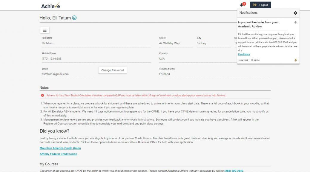
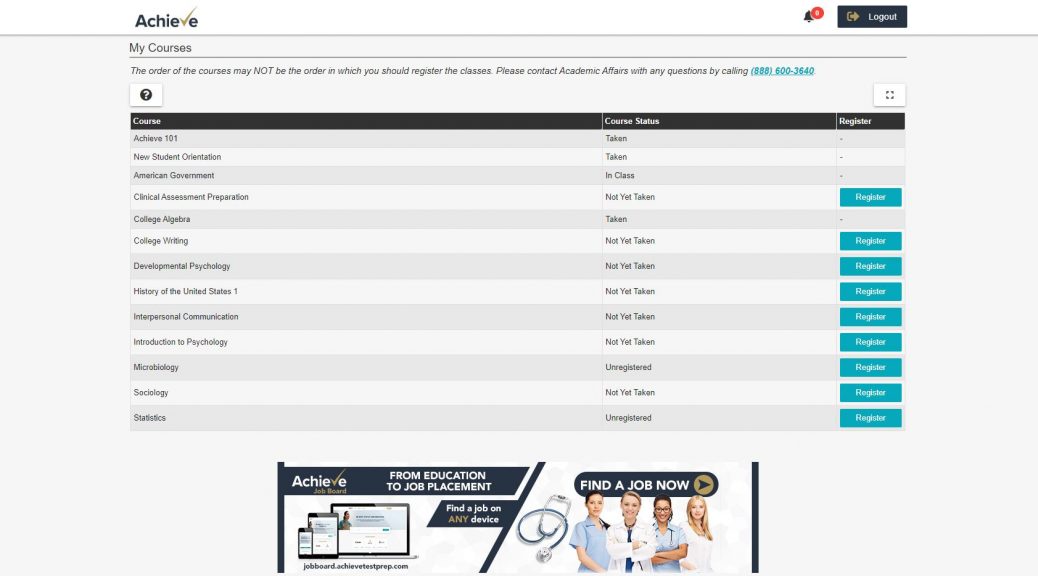
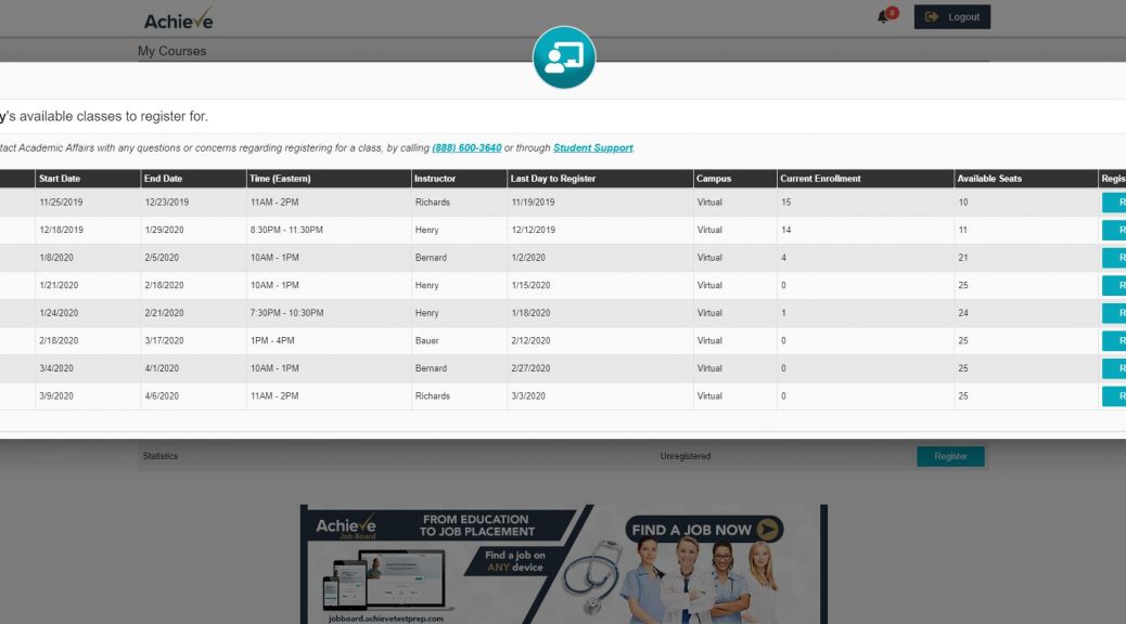
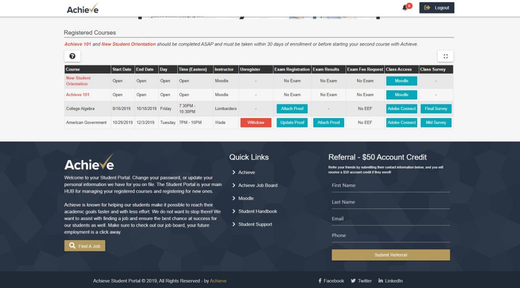
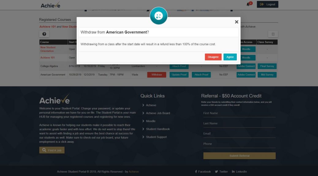
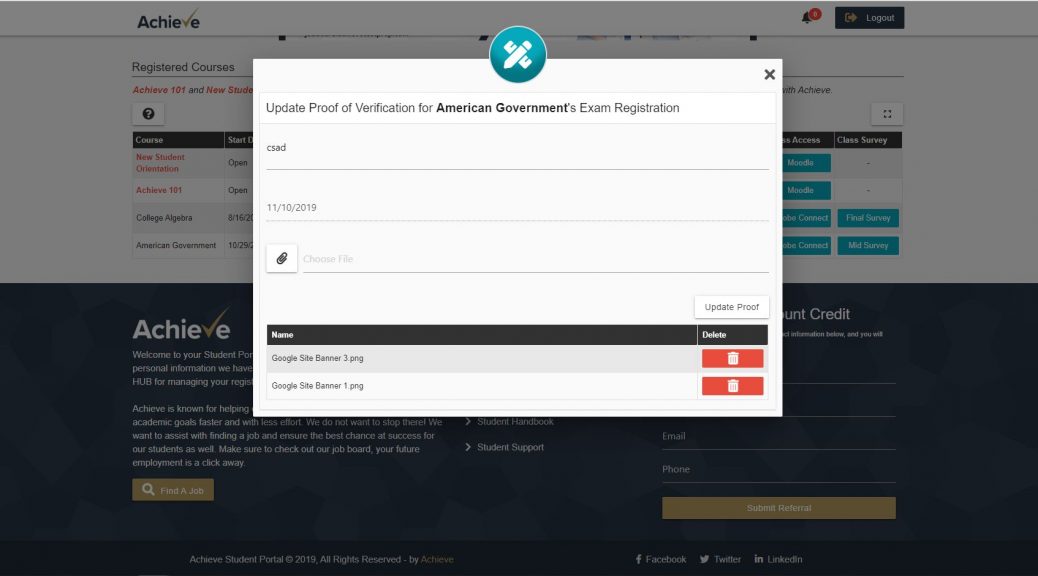
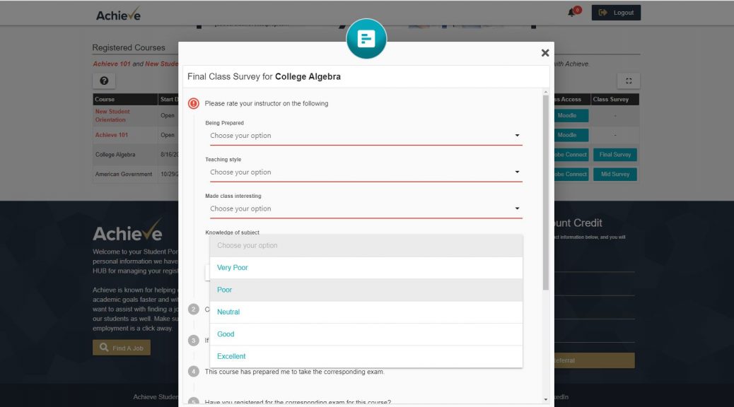
The student portal was an application overhaul. I took some existing functionality on the backend and then basically created a lot of front-end functionality. I took an existing application that was 90% backend and turned it into 80% frontend and 20% backend. The old student portal was terrible to say the least. It had students going to different pages to register for classes and different pages to even change account info.
My project originally started as -- I needed to mobilize the existing portal. Well the existing portal was a spreadsheet with buttons. Just was not happening. I basically told the CEO we need to scrap this whole thing, leverage the backend functionality and rebuild a whole new portal. Thankfully he agreed and it allowed me to build a nice clean user experience for the students. Simple things like this -- enhancing the user's experience, can change the results from a dropped student to a happy student.
This application leverages:
- Materialize CSS
- Javascript/jQuery
- HTML
- CSS
- Bootstrap Table Library
- Salesforce

